
Learn how to customize the visual appearance of your event website using the Theme Settings in the Website Editor.
To open Theme Settings, click Theme in the Website Editor Sidebar. The Theme panel will expand in the sidebar with the following options.
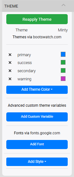
An example of the Theme settings from a demonstration event.
Theme
Clicking the current theme name opens a pop-up window of pre-built themes to choose from. Clicking a theme thumbnail applies that theme to your event website.
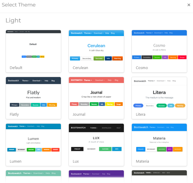
The Select Theme window has both Light and Dark options.
Changing the theme updates the appearance of the Website Editor and the Elements on your website, including the Header bar, page Headings, Forms, and the Item Catalog.
Customize further with Advanced Styling
See Advanced Styling to learn how to apply custom styling to individual components of an Element.
Reapply Theme
The Reapply Theme button re-applies your current theme across the website after you have made changes to theme colors or custom variables. Use it any time you update settings in Add Theme Color or Add Custom Variable to ensure your changes take effect.

An example from a demonstration event.
Add Theme Color
Clicking Add Theme Color opens a panel in the sidebar displaying the colors defined by your current theme. These colors are applied across your event website and are also available as presets when changing the color of individual elements.
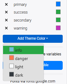
An example from a demonstration event.
Apply changes with Reapply Theme
After changing a theme color, click Reapply Theme to apply the update across all pages and elements affected by that color.
See Color Picker for more information on the color picker and available color options.
Changing a Color
Click a color in the panel to select it, then click the color preview box to open the color picker. You can enter a HEX, RGBa, or HSLa value, or use the sliders to adjust the hue and transparency.
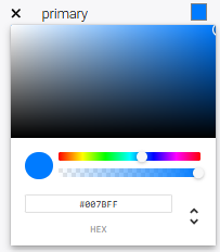
An example of the color picker for the primary Theme color.
Switching between color methods will automatically convert the current value to the selected format. Standard HEX values are six characters long, but two additional characters can be added to control transparency — 00 is fully transparent and FF is fully opaque.
Fully transparent colors
If a color appears invisible, the transparency may be set to fully transparent. Move the transparency slider all the way to the right to make it fully opaque.
Light and Dark Colors
All themes define a light color and a dark color. These are intentionally high-contrast to ensure content remains readable across all pages.
Keep light and dark colors distinct
Changing the light color to a dark value (or vice versa) can cause contrast issues — for example, invisible text in elements like the Shopping Cart. Keep these two colors clearly distinct from one another.
User Interface Colors
Changing theme colors also affects the colors used in the Website Editor Sidebar.
Add Custom Variable
Clicking Add Custom Variable creates a new custom variable that can be referenced in theme styling.

An example from a demonstration event.
A placeholder variable named custom_variable will appear. Click the variable name to open its editor, then enter the variable name and value.
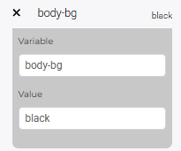
An example of a custom variable to change the background color.
Click the variable name again to close the editor and save. To remove a custom variable, click the X beside its name.
Apply changes with Reapply Theme
After adding or editing a custom variable, click Reapply Theme to apply the changes across your website.
Available Custom Variables
The following custom variables are currently supported:
| Variable | Value Description |
|---|---|
body-bg | Overall theme background color. |
auctria-card-bg | Background color for the card used in multi-step elements and the Item Catalog. |
auctria-card-border | Border color for those cards. |
auctria-nested-card-bg | Background color for cards that have two levels of nesting. |
Learn more
See Custom Website Variables for additional details on using custom variables with your website theme.
Add Font
Clicking Add Font lets you add fonts from Google Fonts to your event website.
An example from a demonstration event.
After clicking Add Font, a text field appears. Start typing a font name — a list of matching suggestions will auto-populate as you type. Click a name in the list to select it.
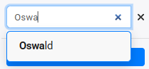
An example from a demonstration event.
Browse Google Fonts
Visit fonts.google.com to preview and find fonts that suit your organization's style before adding them here.
Multiple fonts can be added by repeating the steps above. Each selected font will preview using its own typeface in the sidebar.
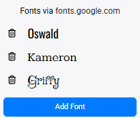
An example from a demonstration event.
Added fonts become available in the Font Family option under Add Style, and in the Edit Content text editor. See Fonts for more details.
Add Style
Clicking Add Style opens additional style options for the theme.
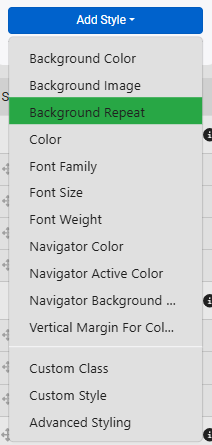
An example of style attributes available for the website theme.
See Add Style for more information.