
Learn how to configure the Header row element, which provides the navigation menu for your event website.
By default, every Auctria event website includes a Header element in the header zone. It provides the site navigation bar — displaying your event name, logo, and menu links — and is best kept in the header zone so it appears consistently across all pages.

An example Header element from a demonstration event.
Adding the Header element to a page
The Header element can also be added to any section of a page by dragging it from Row Content in the Website Editor Sidebar onto the page.
Selecting the Header will open the Header settings in the Editor sidebar.
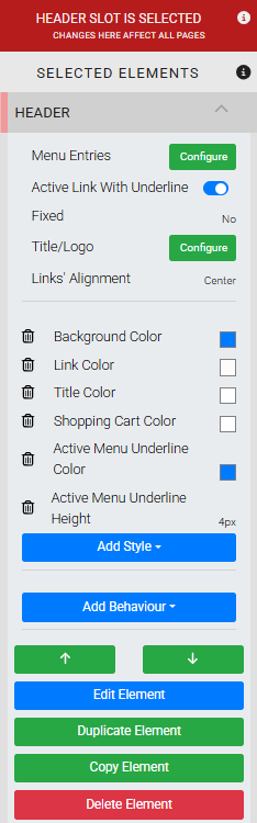
The Header settings panel in the Website Editor sidebar.
Menu Entries
Clicking the Configure button for Menu Entries opens the Header Links window, where you can add, reorder, and remove navigation links — including links to pages, external websites, special pages, submenus, and new pages.
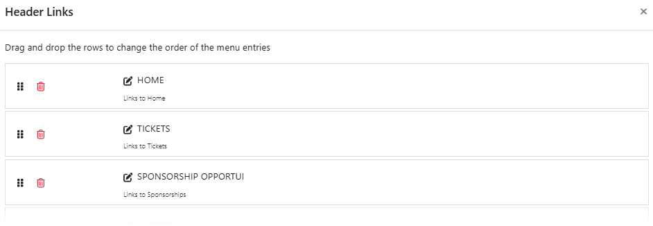
The Header Links window from a demonstration event.
See Configuring Menu Entries for full details on managing menu entries.
Active Link With Underline
Toggles an underline beneath the active menu item (the page currently being viewed). The underline color and thickness can be styled using Active Menu Underline Color and Active Menu Underline Height in the Add Style panel.
Fixed
Controls whether the header stays visible while the page is scrolled. The default is No. Set to Top to pin the header to the top of the browser window, or Bottom to pin it to the bottom.
Title/Logo
Clicking Configure opens the Select Title window.
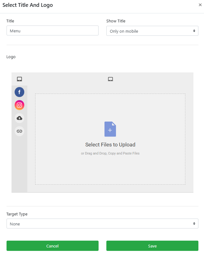
The Select Title And Logo window.
| Setting | Description |
|---|---|
| Title | The text label used as the menu title. |
| Show Title | Controls when the menu title is displayed. Default is Never. |
| Logo | A file picker for uploading a logo image to display in the header. The logo is aligned to the left. Once uploaded, a thumbnail preview appears below the picker. |
Use a small logo file
Large image files are compressed when uploaded and may appear grainy in the header. Use a small, web-optimized version of your logo for the best result.
Removing the logo
Once a logo is added it will always display in the Header element. To remove it, hover over the logo thumbnail and click the trashcan icon that appears. This takes effect immediately without clicking Save.
Links' Alignment
Sets the overall alignment of menu items within the header. The default is Right.
Add Style
The Header element has several menu-specific style properties. The most commonly used are:
| Property | Description |
|---|---|
| Active Menu Background Color | Sets the background color of the active menu item (the current page). |
| Active Menu Color | Sets the font color of the active menu item. |
| Active Menu Underline Color | Sets the color of the underline when Active Link With Underline is enabled. |
| Active Menu Underline Height | Sets the thickness of the underline when Active Link With Underline is enabled. |
| Shopping Cart Color | Sets the color of the shopping cart icon. |
See Add Style and Common Element Actions for more details.