
Learn how to configure the Item Details row element, which displays item information and bidding controls for a single focused item on your event website.
The Item Details element displays a single focused item with its full details, including bidding controls, images, donor acknowledgement, and sharing options.
It is most commonly used as a sub-component of the Item Catalog — when a guest clicks an item in the catalog, the Item Details panel appears. It can also be added to any page as a standalone element to highlight a specific item.
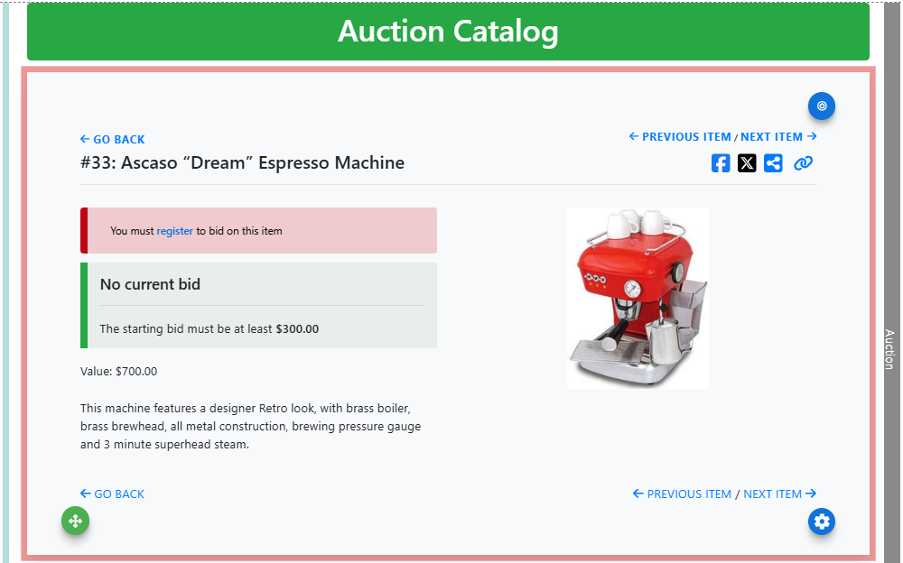
An example of the Item Details element on the event website in Edit mode.
Adding Item Details to a page
Drag the Item Details element from the Website Editor Sidebar into a row, or drag More Row Content onto the page and select Item Details from the Choose Row window.
Focused Item
When added to a page as a standalone element, the Item Details element does not have a focused item selected by default. Click Configure next to Focused Item to open the Select Item window.
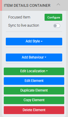
The Item Details Container settings panel in the Editor sidebar.
Start typing in the Select an item field — a list of matching items will appear based on item number or title. Click an item in the results to select it, then click Save.
Sync to live auction
The Sync to live auction toggle should only be enabled when used alongside the Live Auction Controller. Only change this setting if you are an advanced user working with live auction functionality.
Item Details Settings
Click the inserted item (or the target icon in its top-right corner) to open the Item Details settings panel in the Website Editor Sidebar.
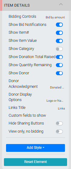
The Item Details settings panel in the Editor sidebar.
| Setting | Description |
|---|---|
| Bidding Controls | Controls how bids are placed from the item's details view. Bid by amount (default) provides an open field for the bidder to enter an amount. QuickBid by default shows a button pre-set to the next bid amount alongside an open field for a custom amount. QuickBid only shows the preset button without an open field. See Item Details for more information on bid increments and starting bids. |
| Show Bid Notifications | Toggles the display of bid notifications. Primarily used with Virtual Live Gala events. |
| Show Item# | Toggles the display of the item number and item description. |
| Show Item Value | Toggles the display of the item value. |
| Show Category | Toggles the display of the item's category, if one is assigned. |
| Show Donor | Toggles the display of the Donor section below the item image. |
| Donor Acknowledgement | Sets the label text for the donor acknowledgement. The default is Donated by. This applies to all items displayed through this specific Item Details element — to update donor information on individual items, see Item Details. |
| Donor Display Options | Controls how the donor is presented. Logo or Name (default) shows the donor logo if available, otherwise shows the name. Logo and Name shows both. Name only and Logo only show one or the other regardless of what's available. |
| Links Title | Sets the heading text for the section where item links appear. See Images and Links. |
| Show Donation Total Raised | Toggles the display of the "Total raised..." label below the item title. |
| Hide Sharing Buttons | Toggles the display of social sharing icons. See Introduction To Organizations for information on configuring sharing icons. |
| Star An Item | When enabled, registered participants can star items from the Item Details view and filter the Item Catalog to show only their starred items. |
See Common Element Actions for more details on managing the Item Details element.