
Learn how to preview your event website at different screen sizes from the Website Editor.
The preview icons in the Website Editor Sidebar let you view your event website at different screen sizes without leaving the editor.
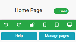
An example from a demonstration event.
Preview Modes
| Preview | Description |
|---|---|
| Mobile | Opens a pop-up window showing a portrait layout that emulates a mobile phone view. |
| Tablet | Opens a pop-up window showing a landscape layout that emulates a tablet view. |
| Desktop | Opens a pop-up window showing a standard view as seen in most desktop browsers. |
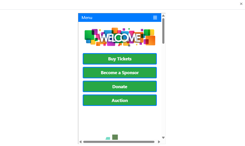
An example of the Mobile preview from a demonstration event.
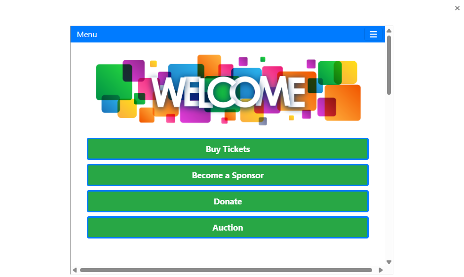
An example of the Tablet preview from a demonstration event.
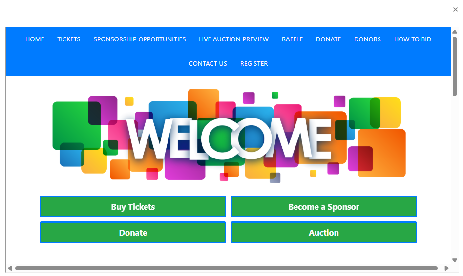
An example of the Desktop preview from a demonstration event.